Wedding Seating Chart Design


Wedding Seating Chart Design
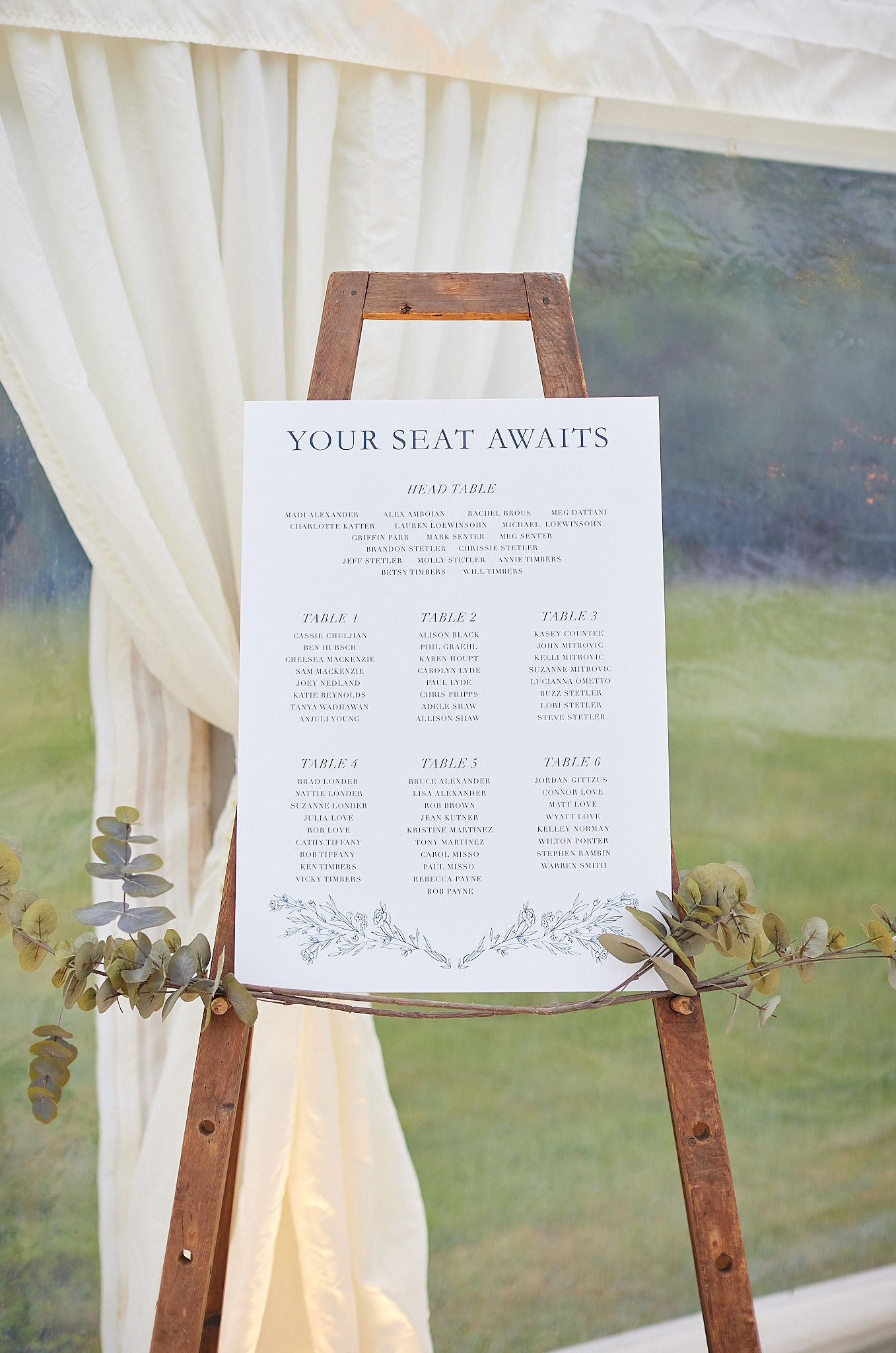
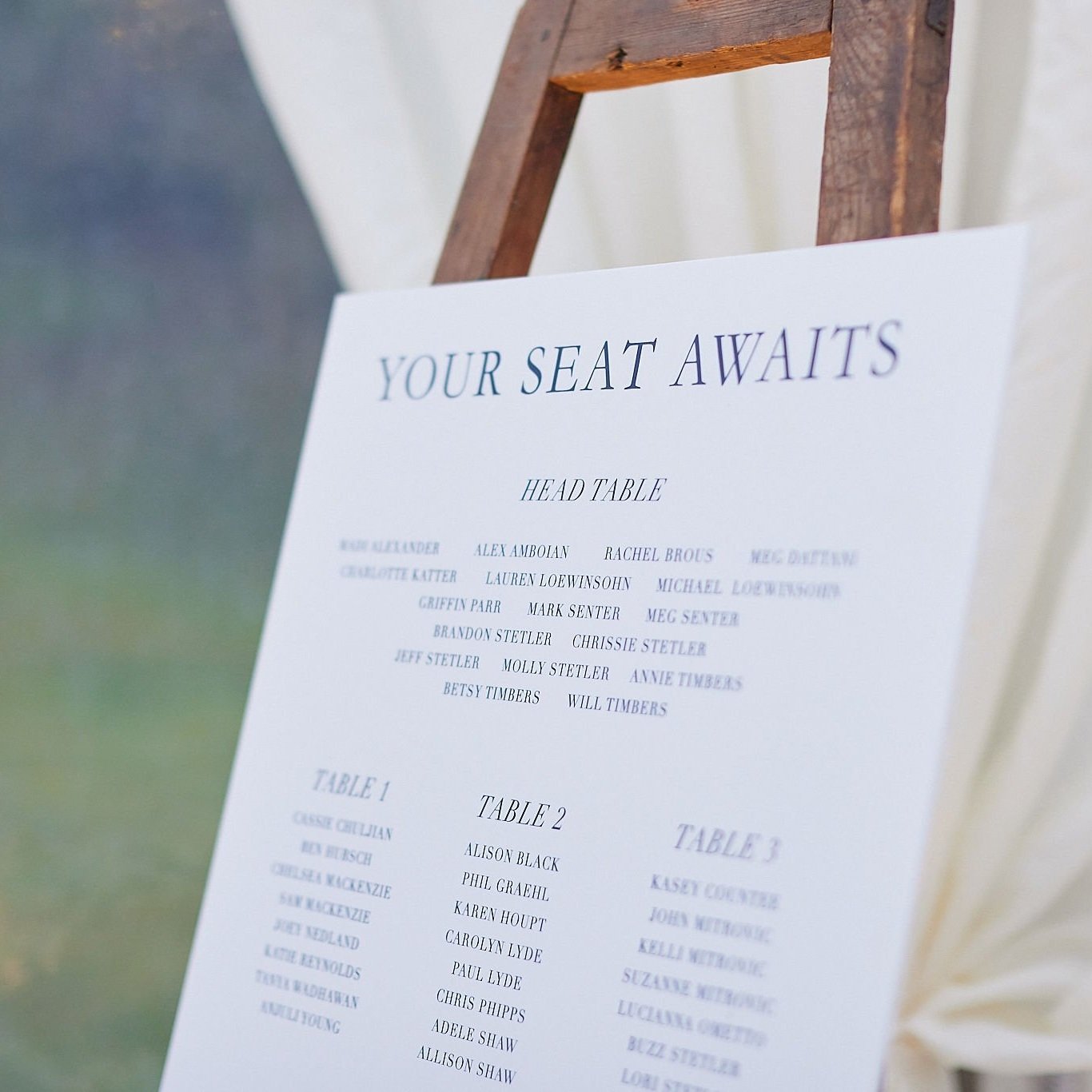
Guide your guests to their seats with this wedding seating chart that can be personalised with calligraphy for an elegant touch.
You’ll receive a digital PDF that is ready for printing on A1 or A2.
This digital design is intended to match my semi-custom wedding stationery collection so that everything matches seamlessly. If you’re planning on placing an order for matching pieces please contact me.
Upgrade to have your names written as a title in calligraphy for a beautifully unique touch that starts life in pen and ink which is then digitised without losing that handmade calligraphy charm (see below for calligraphy styles. ‘Mirabelle’ is shown). Select one of the ‘+ CALLIGRAPHY NAMES’ options.
If I’ve already created your calligraphy names or bespoke illustrations then these elements can be added at no extra cost. Alternatively, a block font can be used throughout whilst remaining stylish. For the main text and table titles, a block font will be used.
The smaller size of A2 (half of A1) should be for no more than 80 guests so that the sign remains clear.
ALL THE DETAILS
SIZE: A2 (42 x 59.4 cm / 16.5in x 23.4 in) or A1 (59.4 x 84.1 cm / 23.4 x 33.1 in)
COLOUR: Black text
ORIENTATION: Landscape or Portrait
FORMAT: Digital, to be sent to print by yourself. You will not receive a physical item.
FURTHER PERSONALISATION: If you’d like to add a venue illustration or different text colour please get in touch.
After your order is placed on this website, within 3 working days you’ll be emailed a digital proof to approve. 1 round of revisions is included to make any minor changes. Additional revisions cost £25. The final proof will be provided up to another 3 working days. You’ll then receive your print-ready PDF file via email which can be sent to a printers, suitable to be printed on materials your printer can offer such as acrylic, cardboard, foam board or fabric.
CALLIGRAPHY
Below are 4 beautiful calligraphy styles to choose from to suit the look and feel of your wedding.
Mirabelle: My signature calligraphy style, Mirabelle is charming and timeless making it a classic choice for a soft romantic look.
Katherine: Based on Emily Bronte’s novel, Wuthering Heights, this style has an old-world look about it that’s elegant and emotive.
Grace: Floaty and feminine, this light script features lots of cross-overs and loose flourishes giving it an organic and dreamy feel.
Camille: Inspired by handwriting found on vintage French correspondence, this calligraphy is sumptuous and embellished with delightful curves.
OWNERSHIP RIGHTS
·All artwork is for personal use only and not commercial - so for your wedding only.
These designs are only to be used for the purpose they were intended - an A1 or A2 welcome sign.
All artwork, both proposed and completed, is the wholly owned copyright of the Artist, and may not be reproduced, adjusted, distributed, or displayed without prior written permission.
Please credit me when sharing my designs on social media using the tag @mirabellemakery. I reserve the right to publish photos of these designs with sensitivity to the timing of your event.
ADDITIONAL INFORMATION
Whilst every attempt has been made to show the colours in the products exactly as they appear, they may look slightly different due to variations in screen resolutions.
The lettering may vary to the photos as this is a handmade to order item and each piece is created individually. See the examples for a guide of what to expect.
Photo props are not included.
Photo credit: James and Lizzie Redman Photography


