A Guide to Dip Pen Calligraphy Nibs
Some of the best modern calligraphy nibs to use with dip pens
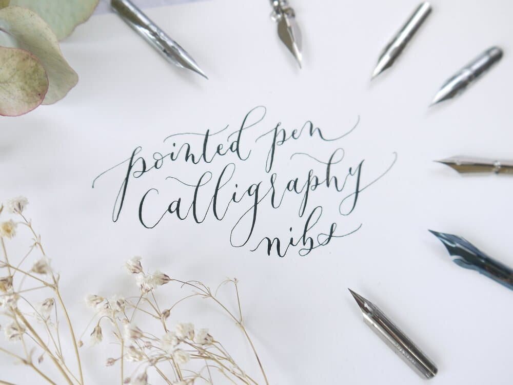
With so many types of calligraphy nibs out there it can be a challenge just getting started with learning modern calligraphy.
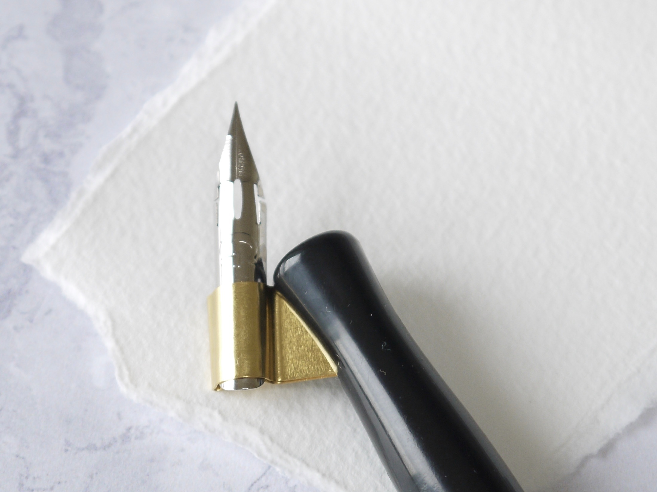
At first glance, nibs may appear to be the same but look closer and you’ll see how different they are.
They vary in shape, size, and the metal they’re made from meaning that they behave in completely different ways.
In this guide I’m going to share with you the pointed nibs for calligraphy that I personally use and give you some tips on how to use them effectively.
(And I‘m saving my favourite dip pen calligraphy nib until the end!)
Choosing Calligraphy Nibs
It’s important to choose the right nib especially if you’re a beginner - using a nib that’s too flexible and difficult to control could put you off and leave you thinking that you’re doing something wrong when in fact it just isn’t the right tool for the job.
Not that I like to blame my tools, but sometimes there’s a good reason to :)
[Learn more about the best calligraphy supplies to use when you’re just getting started with modern calligraphy]
And knowing which is the best calligraphy nib to use before you even put pen to paper will be a God-send, saving you time and money as well as motivating you to continue with this beautiful art form.
All the nibs that I’ve written about here I’ve tried and tested and are available to purchase in my online shop so you can try them for yourself and find your favourite.
How CALLIGRAPHY Nibs Work
I’m just going to put in a quick note here about how to use pointed pen calligraphy nibs work in case you’re new to this.
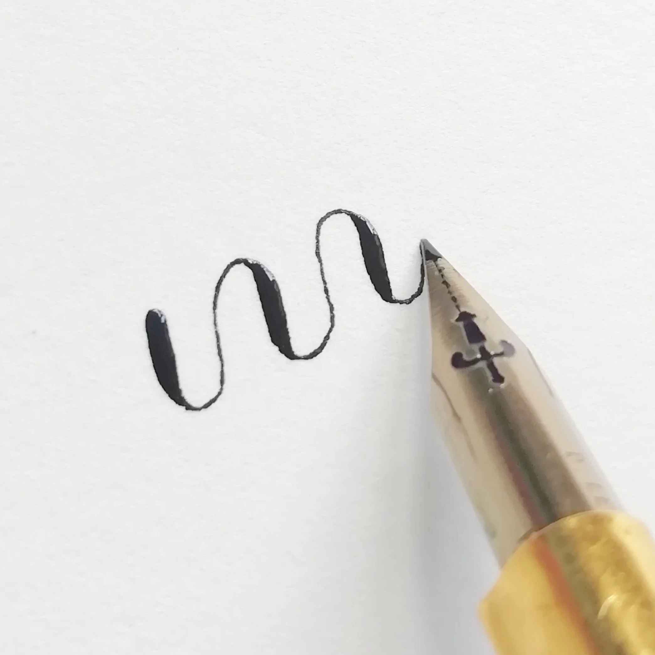
In a nutshell, when pressure is applied, the point at the end of the nib ( the ‘tines’) will split apart allowing the ink to flow on to the page creating a thick line.
To create thin lines the pressure is released which brings the tines back together to a point when the pen is pushed up or across.
Find out how to clean calligraphy nibs to use for the first time
The Calligraphy Nibs Explained
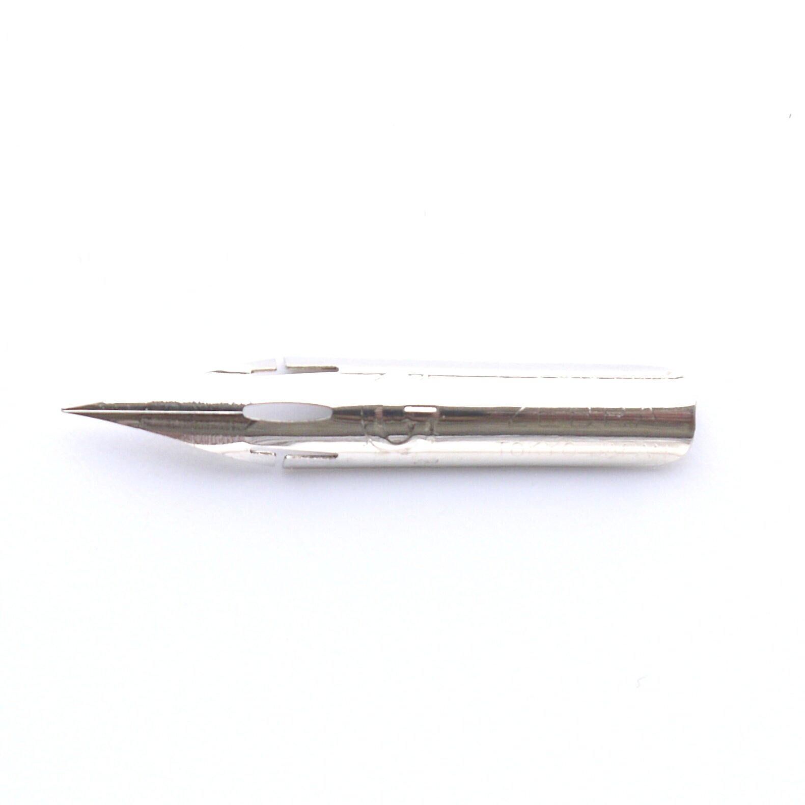
Zebra G
- a must-have calligraphy nib for beginners
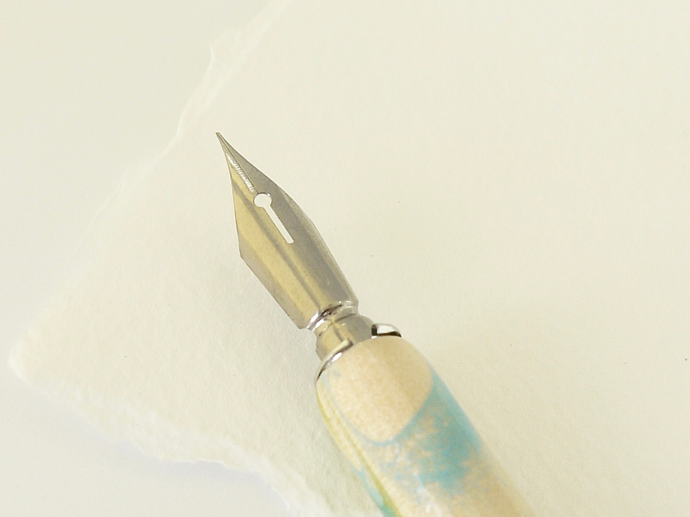
Like the popular Nikko G nib, this sturdy Japanese nib is typically used to draw manga-style comics, but it makes an excellent nib for writing calligraphy and no beginner calligrapher should be without it which is why I always introduce my calligraphy class students to the Zebra G.
It’s sufficiently strong and has been made to withstand speed so it won’t break easily and it’ll last you a relatively long time.
What makes this Zebra G nib so ideal for beginners of modern calligraphy is that it’s capable of making those desirable thick downstrokes and thin upstrokes; this is because of it’s medium flexibility.
It’s a lot more forgiving (and easier to control) than other pointed pen nibs which are more flexible yet it’s still responsive to pressure. Just remember to give this nib a little time to wear in as it starts off quite stiff - a bit like wearing in new shoes.
Another thing that makes me recommend the Zebra G is that it’s a lot easier to clean than the Nikko G; it doesn’t have those small groves on the tines of the nib where the ink dries in and gets stuck - because no one’s got time to spend cleaning calligraphy nibs for longer than they have to!
Blue Pumpkin Nib
- just as wonderful as it sounds
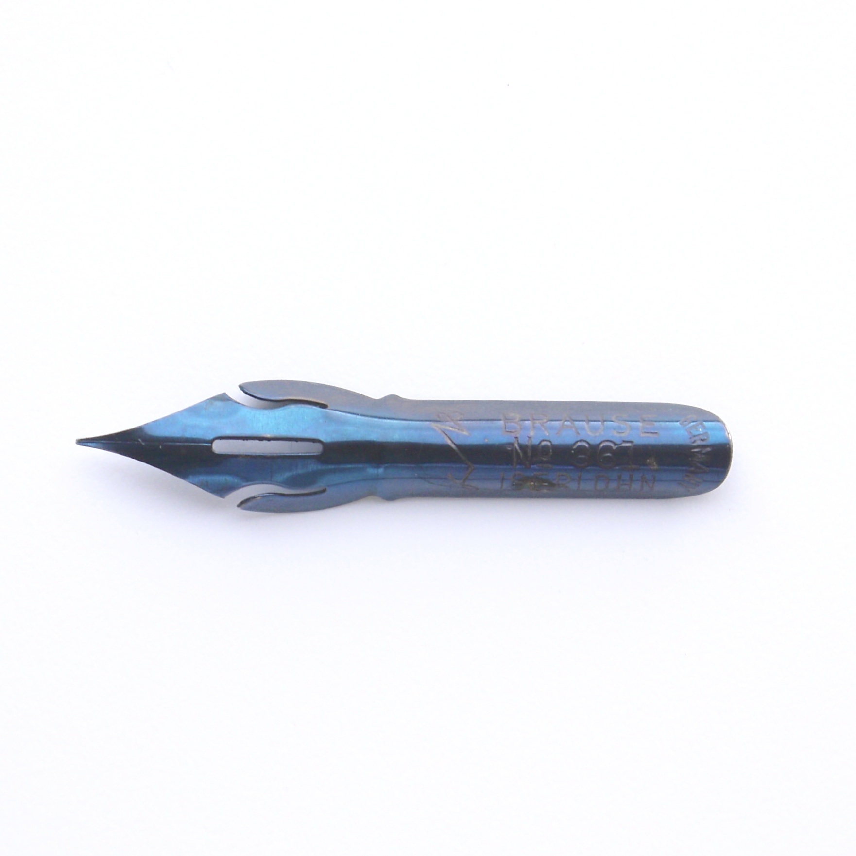
The Brause Steno 361 calligraphy nib -more commonly known as the Blue Pumpkin - is a favourite nib for many (including me) and it’s easy to see why.
This is my go-to nib and I don’t know where I’d be without it. When I discovered this beauty of a calligraphy nib I was hooked from the first stroke.
It’s so unbelievably smooth to write with that you won’t want to put it down as it glides across the paper effortlessly.
The large rounded shape of the nib means that it’s capable of holding a lot of ink so you wont need to keep refilling so often.
It’s also more flexible than the Zebra G, but not as flexible as some other nibs, so it’s great if you’re still in the beginner zone but are looking to take your skills a step further.
Read more about why this is my favourite nib here.
You’ll be pleasantly rewarded with thick downstrokes although your upstrokes will carry a bit more weight due to the slightly rounded nature of the tip.
If you’re a beginner and are looking for a nib with a little more flexibility then I’d recommend this nib.
Team it with watercolour paper to mop up the ink and you’re ready to go.
Top Tip coming up: you can use this blue pumpkin nib with textured paper too as it’s slightly wider point doesn’t catch on the up-strokes.
Leonardt G – Manuscript Nib
- a fine pointed flexible nib
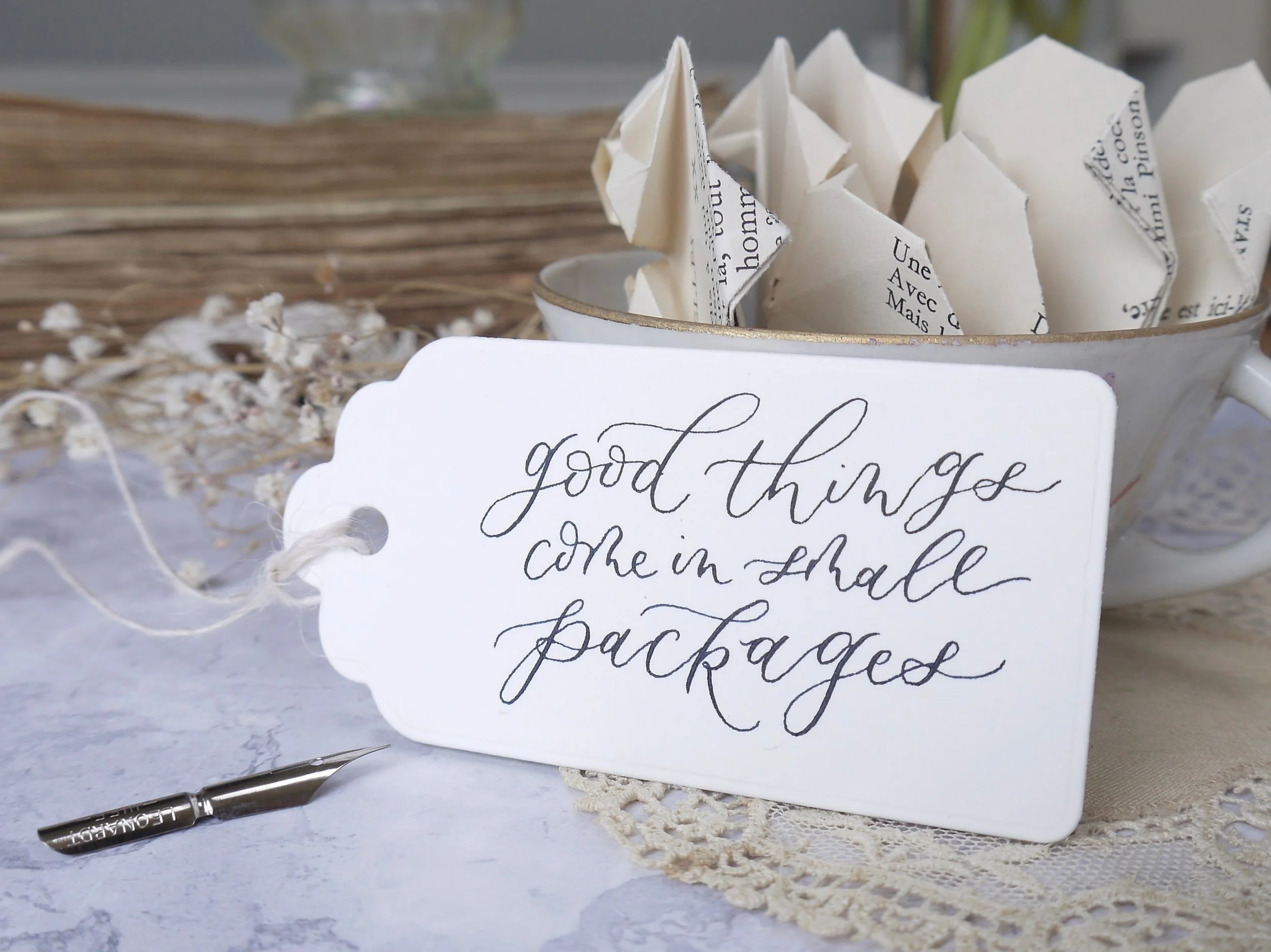
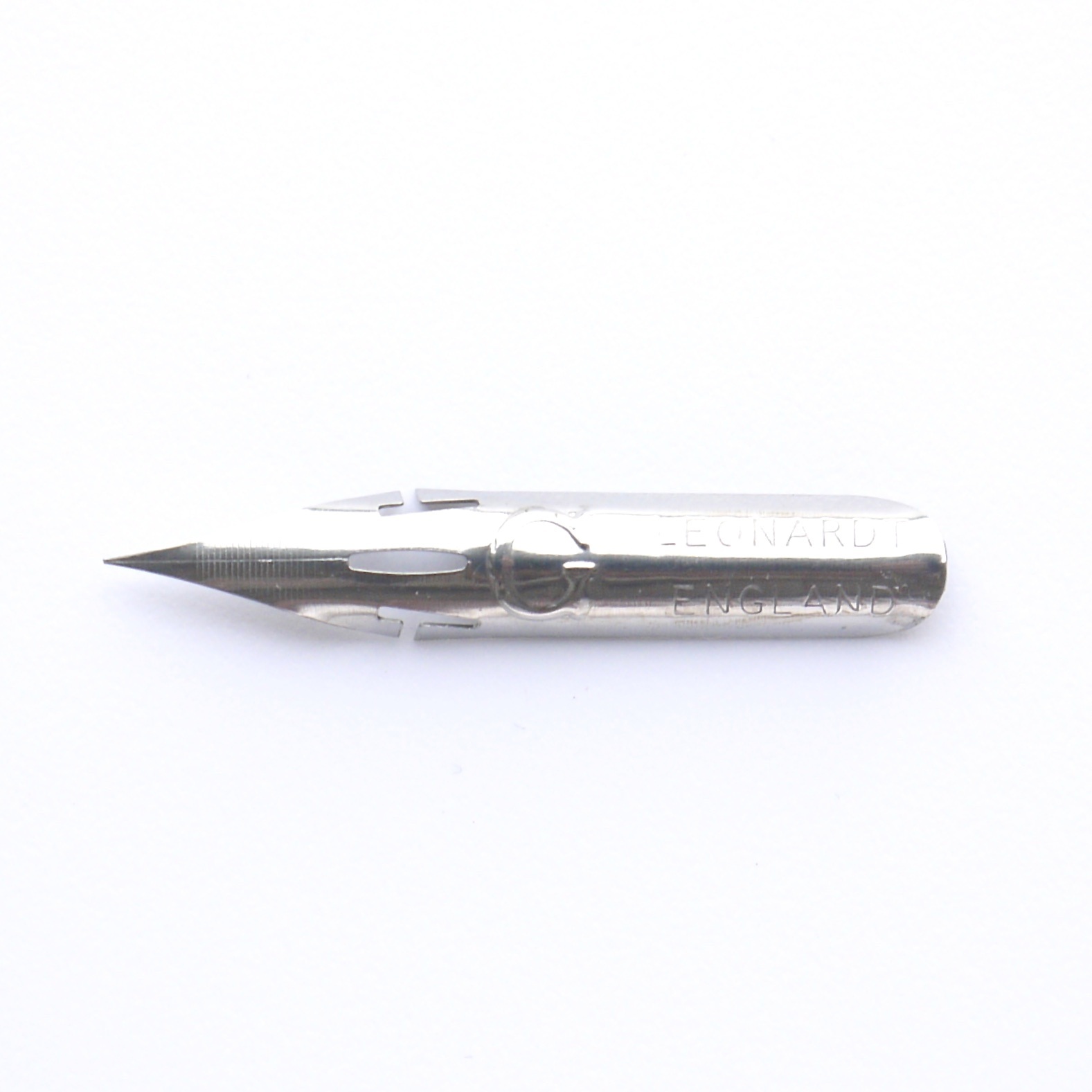
The Leonardt G nib is similar in shape to the Zebra G, although using it is a slightly different matter.
The thing that appeals to me the most about this Manuscript nib is that you can achieve thinner upstrokes along with thick downstrokes - great if you’re looking for more contrast in your hand lettering.
Because it’s more flexible, it means it’s not as strong as the Zebra G, neither is it chrome-coated; make sure you wash the ink off thoroughly otherwise it’ll stain the nib.
I find that it holds a generous amount of ink so you won’t have to keep refilling.
Using the Leonardt G calligraphy nib requires more control though, and watch out for the pointed tip catching on the paper - the smoother the paper the better; this nib doesn’t like writing on textured paper.
Leonardt EF Principal Nib
- the king of calligraphy nibs
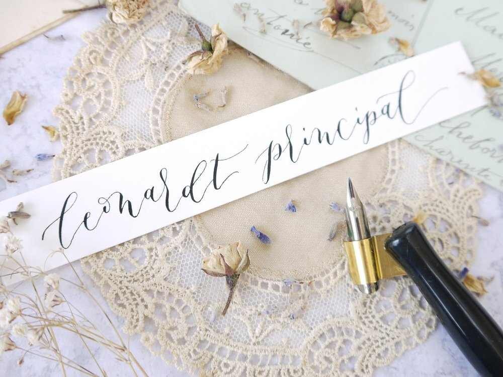
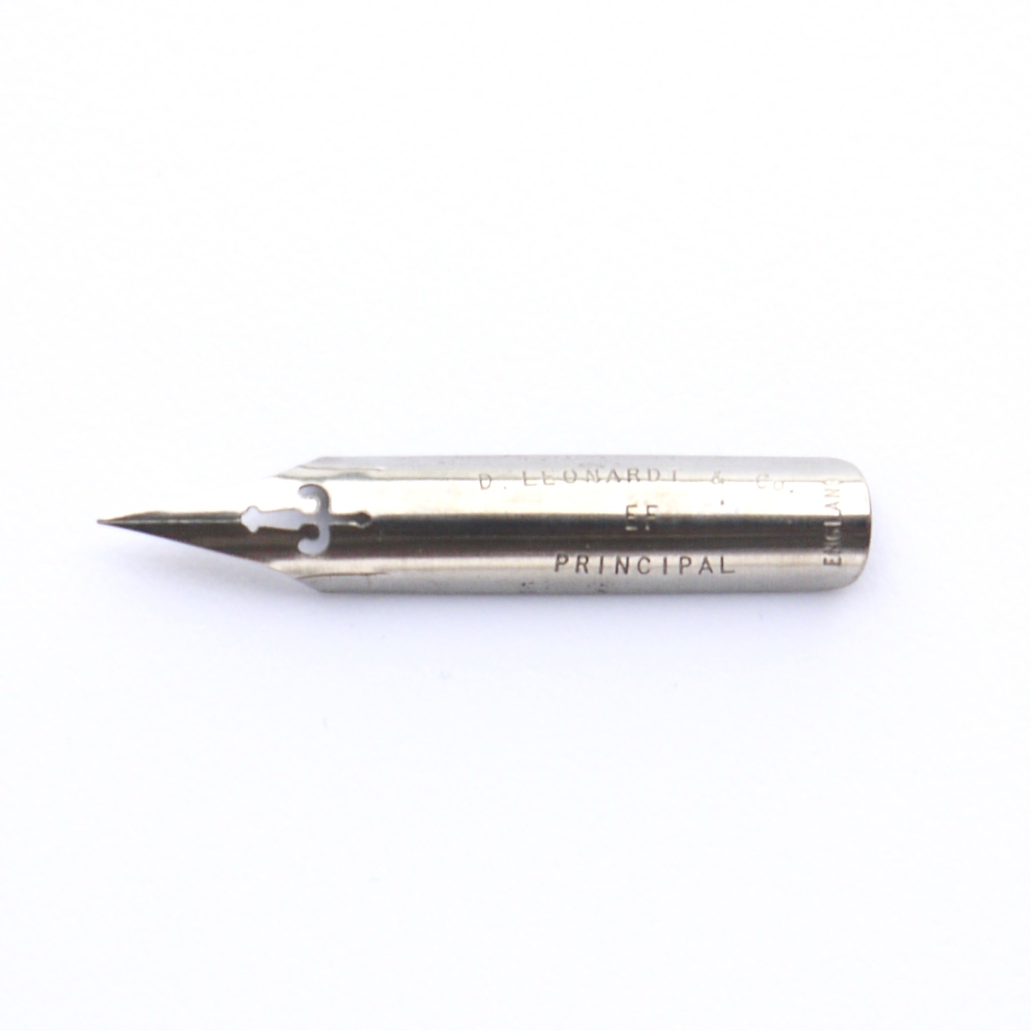
Popular for Copperplate and modern calligraphy, I absolutely love the Leonardt Principal nib!
I remember trying to use this flexible nib when I first started learning calligraphy but its scratchy sound put me off and I couldn’t control it.
Now our friendship has grown and I’ve learnt to love the sound it makes too!
This copperplate nib is perfect for creating modern calligraphy as you can achieve sumptuous thick downstrokes along with beautiful hairline upstrokes for an incredibly pleasing contrast - the tines have a satisfying way of springing quickly back into place when pressure is released.
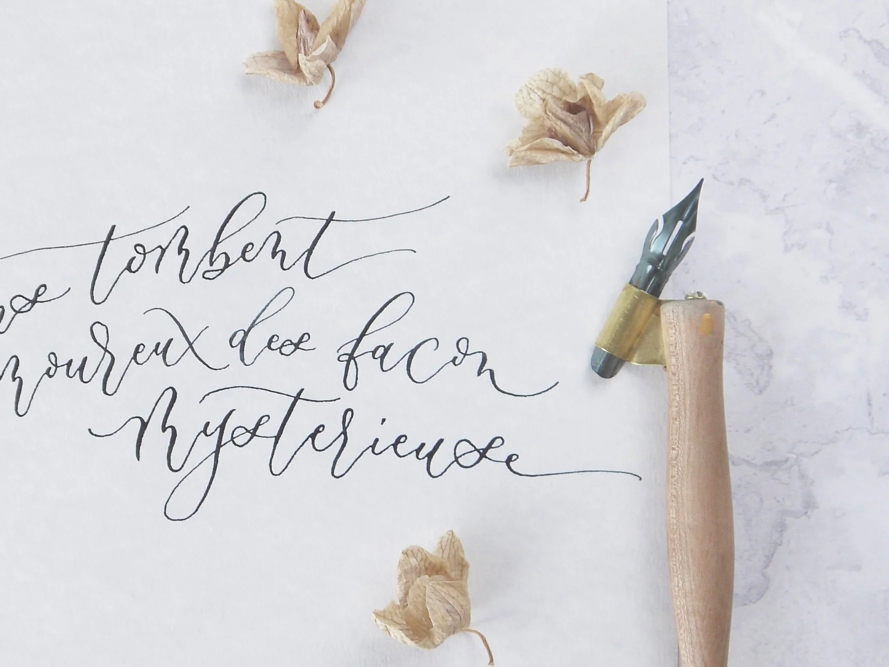
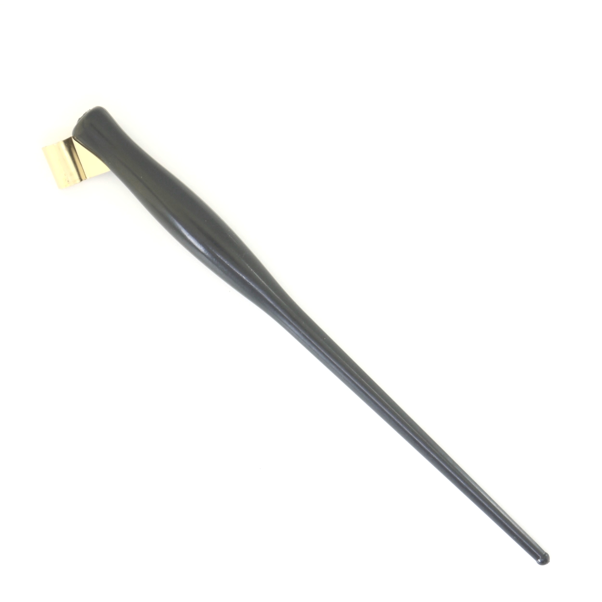
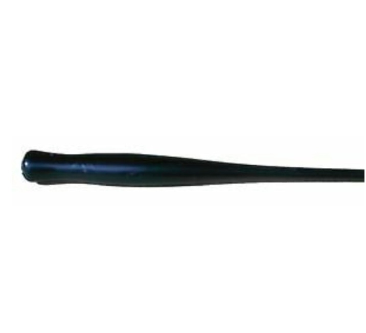
Team this nib with an oblique pen holder for slanted lettering to die for!
Just make sure your nib angle isn’t too high otherwise the pointed tip will catch on the paper sending splatters of ink everywhere.
Plus, using super smooth paper is also a must with this Leonardt nib.
Learn how to use an oblique pen to create beautiful calligraphy.
Brause Rose Nib
– an incredibly flexible calligraphy nib
This vintage-style nib characterised by its rose detail on the base is capable of creating large scale inky lettering.
The Brause Rose nib is super flexible – even with the smallest amount of pressure the tines spread widely apart allowing a lot - and I mean a LOT - of ink to flow down and create thick downstrokes.
But be warned - this nib is not for the faint-hearted!
I’d highly recommend using a highly absorbent paper, such as hot pressed watercolour paper and avoiding watery or thick inks; an ink somewhere in the middle like Daler Rowney System 3 Acrylic Ink should do the trick.
It also has a handy dropper to make ink application easier if you’re using an oblique pen - but you’ll need to keep re-applying it.
I have to confess that I haven’t quite got the hang of this Brause Rose nib yet - although it still intrigues me - but it’s definitely the prettiest nib out there and is capable of creating the most impressive calligraphy!
Leonardt Hief Copperplate
- the perfect nib for small lettering
If you’re looking to create small-scale lettering for miniature or extra-fine calligraphy projects or just creating a contrast by combing different styles then this pointed pen nib is one of the best.
The Leonardt Hief nib is the least flexible of the nibs explained here; the tines don’t split apart much at all resulting in fairly thin downstrokes.
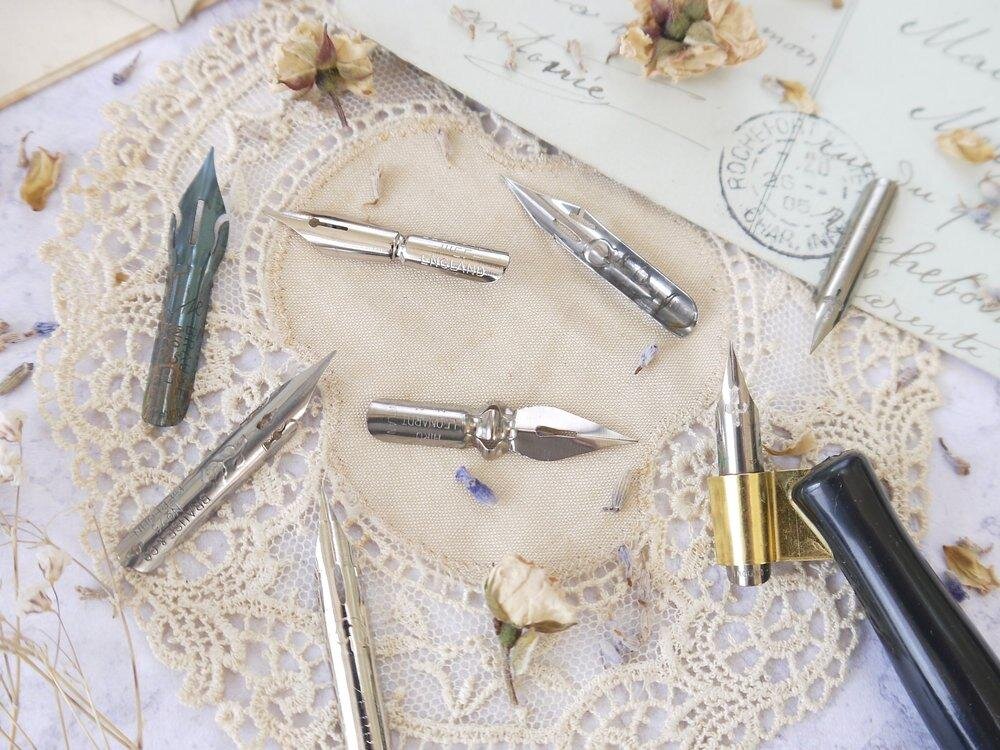
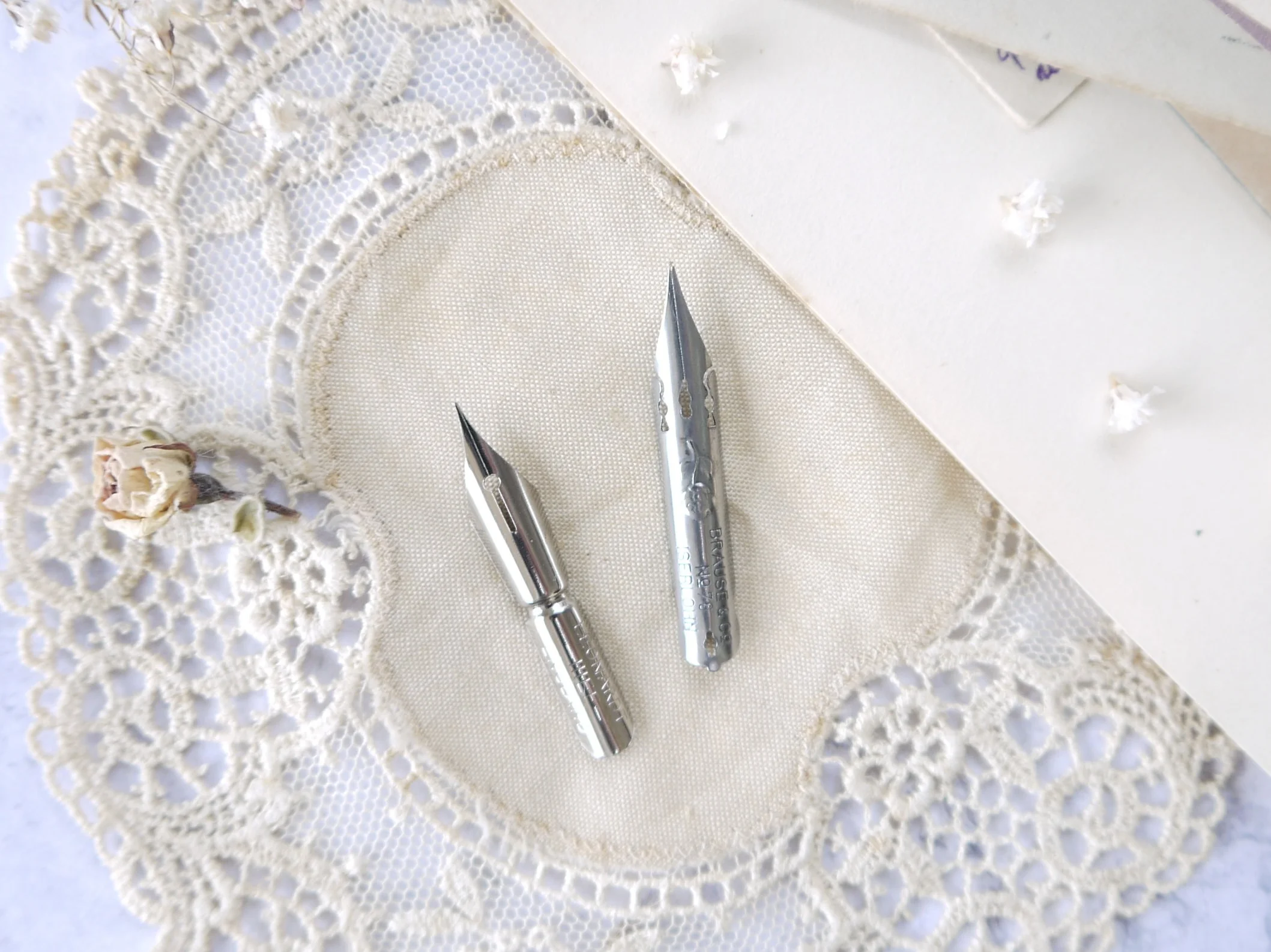
If you compare this nib to the Brause Rose in the photo below, you’ll see how nib shape affects flexibility; notice how the Hief nib isn’t broken up at the sides, making it solid and sturdy and hence not very flexible at all.
The point of the nib is squared off slightly so you won’t get much contrast between the downstrokes and upstrokes, but you will get very neat and controlled lettering if that’s what you’re after.
Leonardt Crown Hiro Nib
- a pointed nib for creative calligraphy
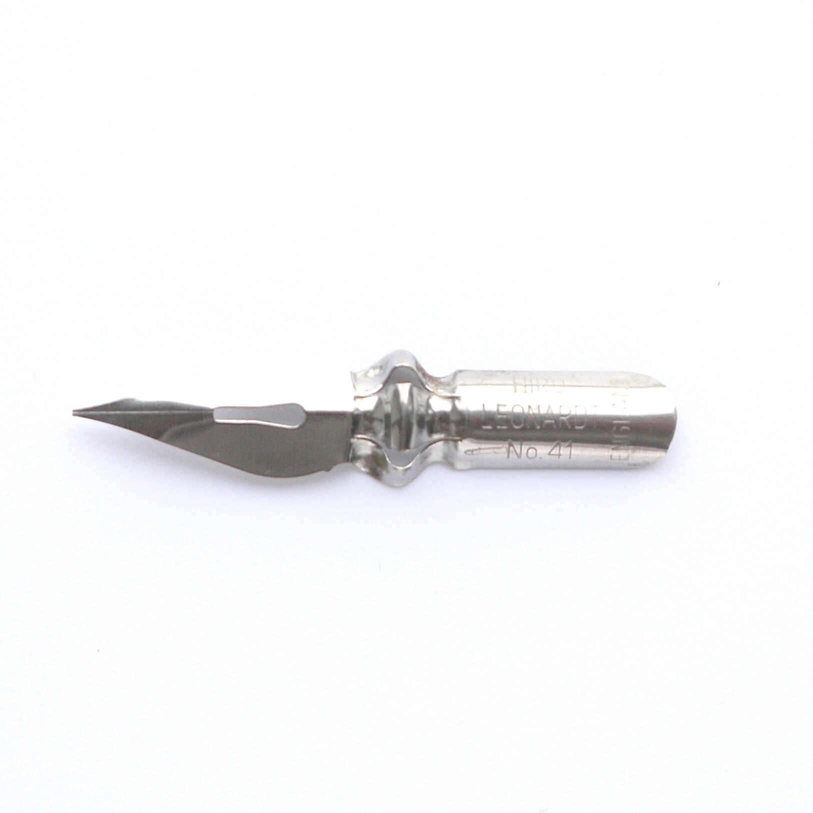
This flat looking calligraphy nib is known as the Crown Nib and if you look at the shape of the nib in the middle you’ll see why. This Leonardt nib is fairly flexible but don’t let that put you off.
It’s not super-sensitive to pressure like the Brause Rose nib, however if you’re not careful this calligraphy nib can take you in all sorts of directions - which is why I’ve called it ‘creative.’
Because of it’s flat shape you’ll have to work harder to control it as it tends to move from side to side without much persuasion.
Having said that, it’s a pleasing nib to use - it’s capable of creating plenty of contrast between the thick and thin strokes and it can move smoothly at speed well without catching on the paper.
You’ll have to load this nib with ink fairly regularly though as the flat shape isn’t capable of holding much.
Leonardt 30
- a popular nib for beginners
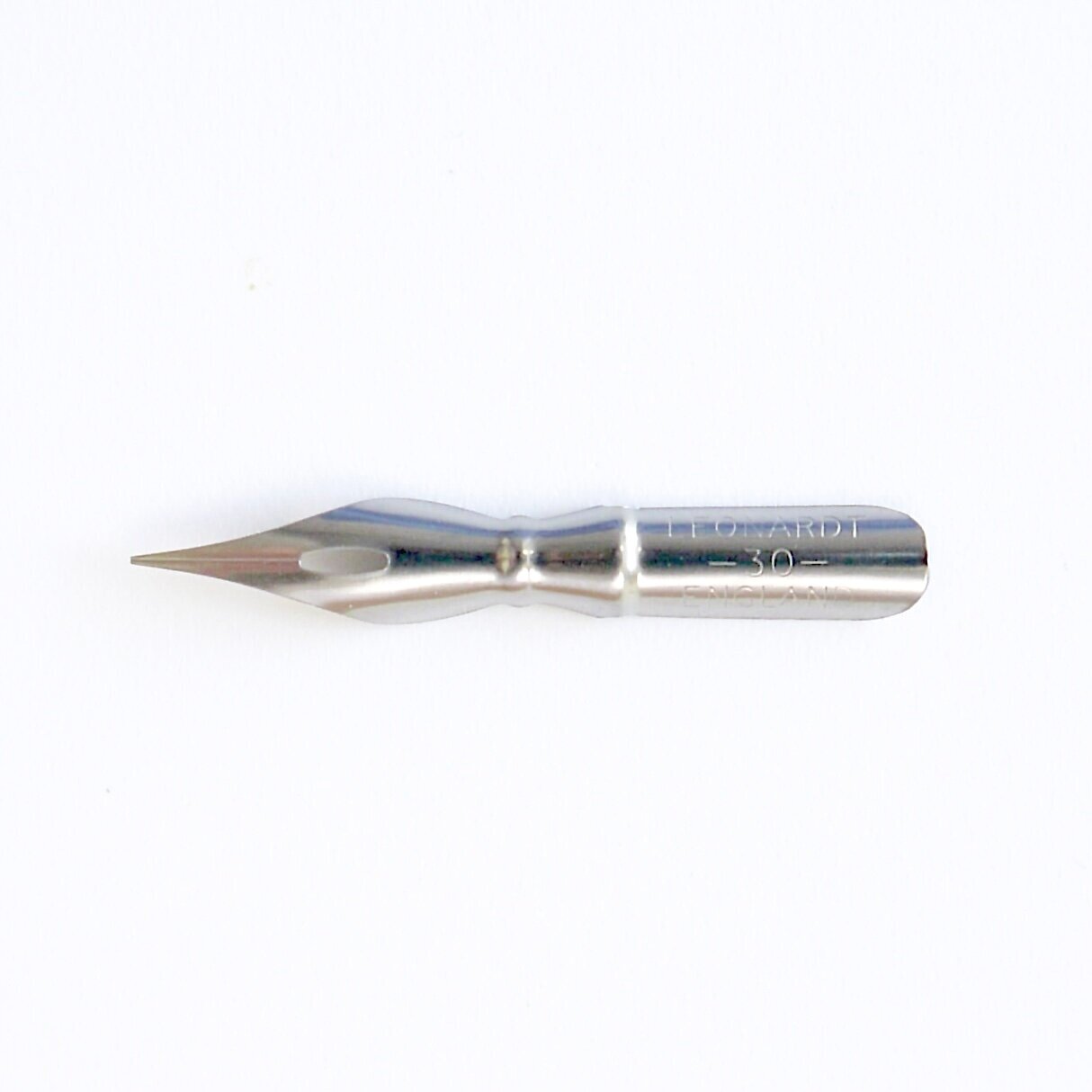
If you’re looking for a beginner calligraphy nib but with a slightly wider nib then you’ll love the Leonardt 30.
But be warned - there’s a definite scratch to it that isn’t everyone’s cup of tea, although I don’t mind it.
Like all good nibs for beginners it got a medium flexibility so you get a good contrast with those sought-after thick and thin strokes yet it’s also stable because of it’s wide shape.
It holds a fair bit of ink, just like the Blue Pumpkin, however I personally find it’s more forgiving when you’re writing on practice paper and you’re less likely to get ink everywhere.
It’s good for textured paper too as the squared off nib means it won’t catch like a pointed nib would.
One to try if you haven’t already!
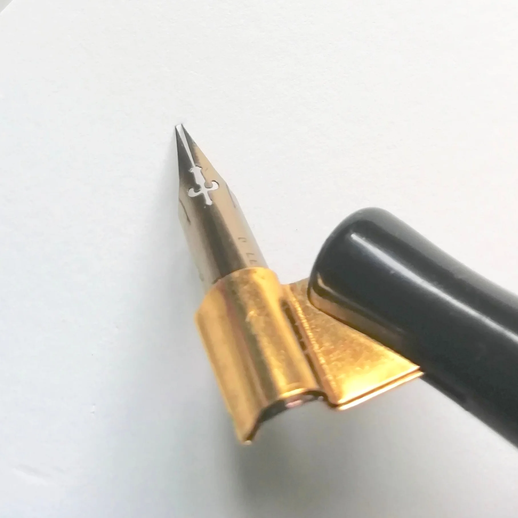
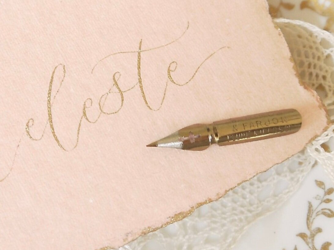
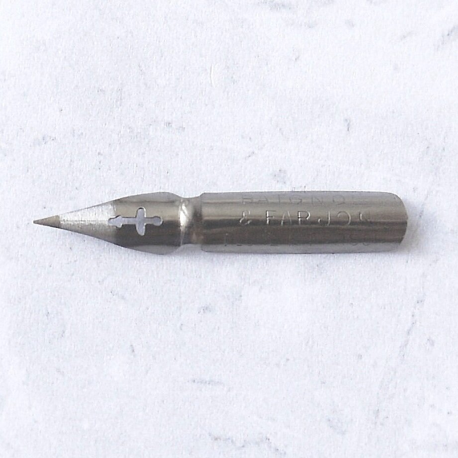
Baignol & Farjon Kifersor
- a vintage pointed nib… and my current favourite
I discovered this vintage nib whilst treasure hunting in my favourite second-hand shop in the South West of France one Summer.
Not one of the chic Brocantes, more like Steptoe’s back yard but I’d certainly felt like I’d struck gold - and still do!
I found 3 boxes of nibs - and had to have them all because I simply couldn’t help myself - but the one box containing these nibs was something special.
As to their age, I don’t know how old these nibs are but they looked as good as new and when I tried one out I thought I was dreaming.
It sounds a bit over the top - and if you know me you’ll know I’m not an OTT kind of person - but I became obsessed with this nib and I can honestly say that it’s my new favourite.
Small yet perfectly formed, it’s on the less flexible side but you can still create a range of strokes which to me are elegant and refined yet beautifully expressive - everything I want my calligraphy to be.
I used this nib excessively for a year until it started to behave oddly and needed replacing so it’s definitely made of strong stuff. Yes - I should replace my nibs more often but I do become attached to them!
See how I used this nib I used to create the wedding invitation suite for ‘Shades of Wuthering Heights.’
Photo courtesy of James and Kerrie Photography
I hope you’ve found that helpful at de-mystifying some of the different calligraphy nibs that are out there.
If you’re just starting on your modern calligraphy journey then I’d suggest writing with one or two nibs to get a feel for them, then honing in on one and sticking with it. This way, you’ll really get to know how the nib works and be able to control it - with enough practice of course :)
Although switching your calligraphy nib and trying something different can open up a whole new world.
If any of this advice has been helpful then let me know in the comments and feel free to share your favourite calligraphy nibs.
And if you think that other people would find this post useful you can pin it to Pinterest and share the love!
Thank you so much for reading. Happy calligraphing!
Charlotte x
